We're back with more goodness from Nicholas Kole! Here are parts one, two, and three to get you caught up on our conversation. Stay tuned for part five!

Madame Sidler: Um, so here’s a question from Danniby—not that Danniby; the other Danniby—I assume not that Danniby—“How do you create compelling color schemes for environments and scenes within the limitationss of realistic colors? I can’t seem to make them coexist. To clarify, when I try to stick to believable colors I end up breaking my color scheme. How do you avoid this?”
Nicholas Kole: I would say to Danniby, I am not the biggest believer in the importance of realism.
[laughter]
MS: As a fictional character, I’m with you.
NK: Yeah, I just—visually... how do I say this? The fullest answer would be a long artistic conversation over coffee. But in short, I think for storytelling and for things like the Wingfeather Saga, our priority with color was to tell the story. The secondary priority was a sense of realism in grounding it. We didn’t want to go so wacky and wild, but we really did want to set up the colors and make them dynamic and powerful in a way that emphasized the moment narratively. For instance, when the Black Carriage is racing through the streets of Glipwood, it’s not writ anywhere that it must have a lantern on it, but it must. There’s got to be a pop of orange light, because you’re looking at the space, it’s nighttime, so you’re going to create a space that’s largely blue and green. A contrast in complementary color has got to be an orange glow. So, to track this object we want you be to looking at, we’re going to add a lantern or some sort of source of light that’s going to draw your eye, your attention. Likewise, with the dragon, we’re trying to create these scenes where your attention stays exactly where it ought to stay—you’re not looking off to the side of the screen and paying too much attention to the blades of grass, or the tree branches or whatever. Later you can if you want, but we want you to feel as you move through the story that you’re locked in.
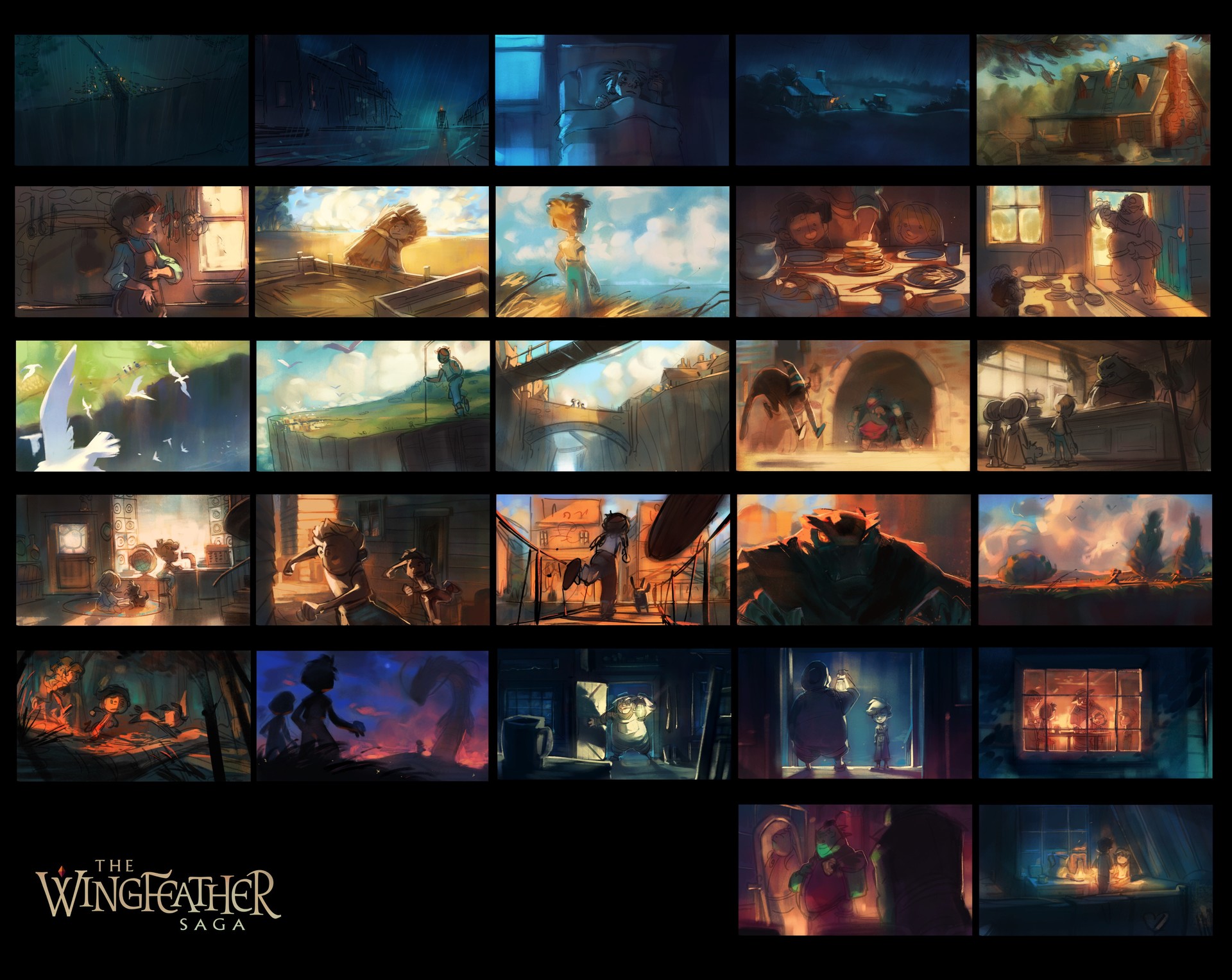
A big thing that I wanted to do—that was definitely a point of some contention, we sort of argued it back and forth as we went—but I created a color script for the whole pieces before we went in, which is basically just a really rough pass on the color scheme of each scene. We start in the dark of the night but then we break to morning, it’s breakfast, it’s a warm family time, so the colors are very natural. But over the course of the short the peril increases, and I wanted that to be mirrored by a shift in the color. So, the sunset. And basically we try to get the passage of time through the short to work such that by the time the dragon appears it’s just the right moment for the sky to be as dramatic as we can make it. So it’s just that moment when the sun’s still at the horizon, it’s sunset but it’s kind of twilight, the moon’s in the sky, and things are quite dark and the shadows pool and stuff like that. My sense was that the dragon moment would be most powerful in that framing than in the middle of the afternoon. Does that make sense?
MS: Yeah. Definitely, as the story gets more intense the colors also get more intense.
NK: Yeah. So I would say it’s about sussing out what your priorities are for the scene. If you’re trying to create a scene of warmth and comfort, you’re going to create your color scheme in a particular way, and if you’re looking for dynamic perilous action, then you might approach it very differently. And not being tethered too much to realism but sort of allowing things to move emotionally with your priorities, that's the way I prefer to work.
MS: Yeah. That makes sense. I’m thinking about the scene around the breakfast table where there’s a lot less contrast in the colors, everything’s sort of at the same level, everything’s light and the colors are not as deep and they’re not as intense, and then you’ve got those really rich sky colors, and the black-black and the very magenta-magentas and all of that later in those more dangerous scenes.
NK: Yeah, for sure.
MS: Very cool. I love it, by the way.
This week, Madame Sidler will be reading chapters 21-25 of The Monster in the Hollows. To weigh in on any of the conversations currently happening in the forum (a quote game, books we love, guildling signups, the short film's animation style, and more), dive on in. :-) We'll see you on Friday for an excerpt from this week's reading!